Saturday, 26 October 2013

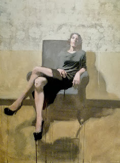
Antony Williams


I had the pleasure of viewing some of Antony Williams' paintings this weekend at the Toronto Art Fair. The meticulous quality of layers upon layers of brush work in tempera paint was marvelous to view in person. The depth of the medium itself was something to see. Through this layering, Williams establishes these figures appearing deep within thought, disconnected from the world around them. Maybe it is by nature of sitting after sitting after sitting (paintings may take upwards of a year of weekly sittings) where Williams painstakingly analyzes and depicts every nuance, these sitters have a chance for reflection, and in this mindful state they are depicted. I couldn't help but think of another painter while viewing Williams' works; Lucien Freud, specifically his earlier works. The layers of paint echoes an approach of Freud but also the atmosphere that the figures take part in share similarities. The viewer becomes engulfed in the figures head space, the workings of their mind. We see their exteriors but what intrigues us is what lives they have lived, what memories they have, what are the influences responsible for tampering with their beings to make them who they are as they stand before us represented in brush stroke layered on top of brush stroke. And what light was shed during each sitting? What became of these relationships between sitter and artist? 

http://www.antony-williams.com/


Sunday, 20 October 2013

Laine Groeneweg


Laine Groeneweg was the soul inspiration behind my own indulgence into the print method of mezzotint. I stumbled upon his works at Open Studio in Toronto and stood in awe at the softness of textures and form he was able to achieve within his figurative mezzotint works along with the rich blacks that are a virtue of such a practice. He also delves into the world of etchings and wood blocks (no wood block prints are shown here but the first is an etching and the proceeding images are all mezzotints.) His figures confront the viewer, establishing the chance for a conversation and a narrative to unfold. Why are children participating in such laborious practices? Why do some of the figures combine form and take on traits of the mighty machine they should appear to simply operate? The worlds of work and play are intermingled and combined. In the final image, the boys hands are of the working class. They show a laborious life that is not present within the face of the boy. However, his gaze, along with the girl as the seamstress, assure us they are in the roll they should be. They do not question where they are, only confront the viewer to ponder such questions. 

http://lainegreenway.com/
http://laine.lainegreenway.com/

Tuesday, 15 October 2013

Julio Reyes: A Master of Edges


Julio Reyes depicts figures in isolation pushed against a backdrop that is far more immense than their own being; a city scape, mountainous range, the stars reflected in the darkness of a body of water, twigs far outnumbering a bird who sits atop of them. His figures tend to participate in an act of reflection and contemplation in regards to the world around them. However, the figures are never dwarfed, they never appear smaller than the immensity that surrounds them. Their mind, body language, and gaze is what draws the viewer in to question their thoughts and being.
In drawing and painting, Reyes captures such soft textures within his cross hatching approach. Every edge is delicately handled and purposeful in execution. Whether on copper, linen or paper Reyes creates a meshing and weaving of mediums to establish these volumetric and breathing individuals who stand frozen in time.

http://www.julioreyes.com/

Sunday, 6 October 2013

Michael Carson: Push and Pull


Michael Carson is a figurative painter who leaves his works in the midst of a haze. Aspects of the paintings, in regards to a more classical approach almost appear as an under painting, however in many instances he introduces bold rich black areas in contrast to such grey tones. This allows Carson to play with the idea of push and pulling parts of the painting to primarily jump out as others recede into the backdrop and fusing with the background. In the painting of the man seated in front of a blue backdrop, the right shoulder and arm or the figure disappears into the haze of a shadow his upper body seems to occupy. This however does not allow the eye to strain in finding where such a body part escaped to. Carson eliminates such unnecessary information and allows the viewers eye to fill in the information that is needed (The eye is a magical thing.. you can let it do some of the work when making art.) One reason I am drawn to his works is the beautifully rendered shadow shapes that are so simple in execution that exist throughout his paintings. In the lights the figures are able to take on more flesh baring qualities to establish them as being alive. The other aspect I am drawn towards is their complete sense of isolation and loneliness even when presented in larger groups. 
But as a final statement - the man in the bow tie against the wall paper with his head turned to see his excellent profile.. is just marvelous.  

Tuesday, 1 October 2013

John William Godward: 1861-1922


John William Godward took his own life at the age of 61. In his suicide note he expressed how "this world is not big enough" for himself and Picasso. Godward was a british painter with the expertise of neo-classical renderings, but in more modernist times, he soon fell out of favour. His parents disowned him for becoming an artist and following his suicide, burned all papers, photos and documentation of any kind on their sons life. This sense of isolation, angst, and solitude becomes extended into his figures. Distance, contemplation, loneliness all become evident within his paintings. The female form he paints with exquisite beauty, the pink porcelain flesh tones, the marvelous fabrics and beautiful marble backdrops. The fully nude figure in the third painting expresses a gaze different than the others. It is haunting, dark, and aggressive. Her back is straight, her body is directed at the viewer. This sense of confidence can also be seen in the image of the woman figure holding a staff, however it is the darkness in the eyes of the nude that elevates this work beyond the others. The figure is contrasted against the dark background while her black hair and darkened eyes are contrasted by the bright sky. She calls all attention and it is difficult to allow your eyes to stray.